It is normal for the news to show catastrophes and extraordinary events, because that is what is newsworthy.
To see how the life of humanity as a whole is improving, you have to look at global statistics to see how it has evolved in recent years and decades. You can see how we are living longer, getting sick less, becoming more educated and our society is safer and more peaceful for everyone.
You can obtain this data from various reliable sources, such as Our World in Data, Gapminder or supranational organisations such as the UN and UNESCO. All of them are based on objective data collected in each country, without political bias or opportunistic inferences. They only seek to know what the reality is like.
Thus, when we dive into this tangle of data, we find the expected facts, such as the fact that life expectancy is increasing, with Japan, Singapore and Spain leading the way, with 85.2 years in 2022.

Of course there are poor countries, or rather, part of the population of that country that lives in poverty, since in any territory there are people with both high and low incomes, the important thing is to know the percentages in each bracket.
Because of this characteristic, a good way to segment the population is by how many dollars they earn per day, more than in developed and underdeveloped countries. With this technique we find different levels, mainly 4, which would be:
- Level 1: less than $2 a day, extreme poverty according to the UN.
- Level 2: less than $8 a day.
- Level 3: less than $32 a day, middle class in China.
- Level 4: less than $124 a day, middle class in the West.
In countries like China, the majority of the population is at level 3, with poverty being at level 2 or 1. In Western countries like Spain, the majority of the population is at level 4, with poverty being at level 3 or below.
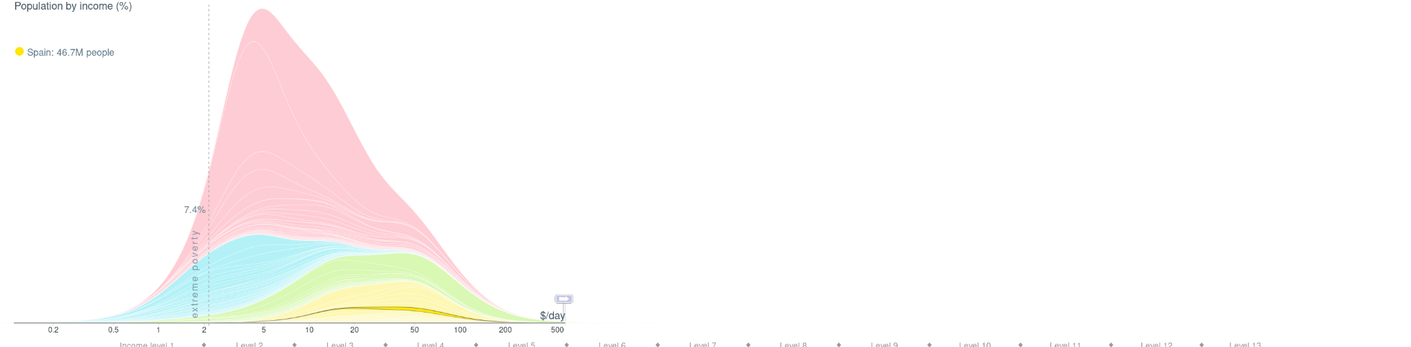
With this organisation we have a more precise vision of the reality of each country, being able to better understand its evolution over time and the standard of living it has. In the year 1800, approximately 85% of humanity lived at level 1, i.e. in extreme poverty. All over the world, people simply did not have enough to eat.
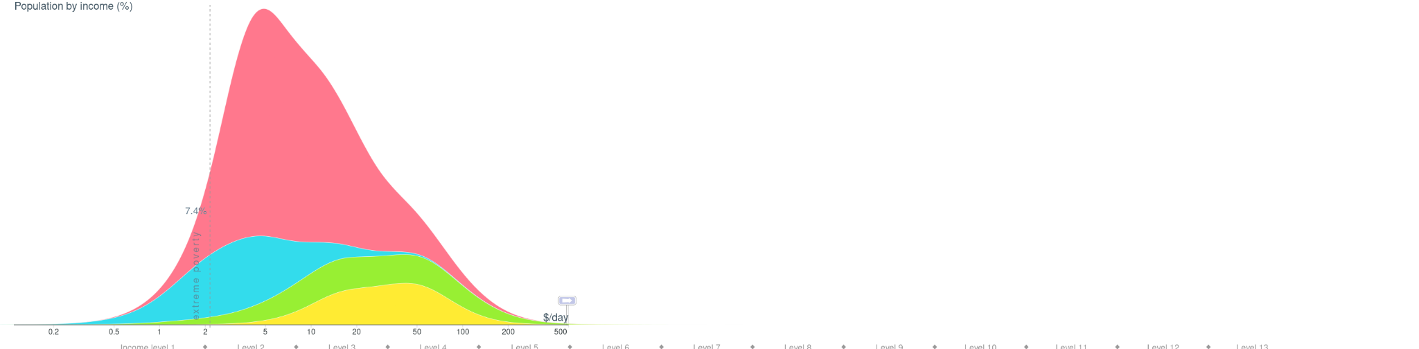
Today this percentage is 7.4%, as this global graph shows:
With all the data out there to look at, it would be nice to find a meta-data that would allow us to see if society is making our lives better. Something like summarising a country's economic power with GDP, but applied to life.
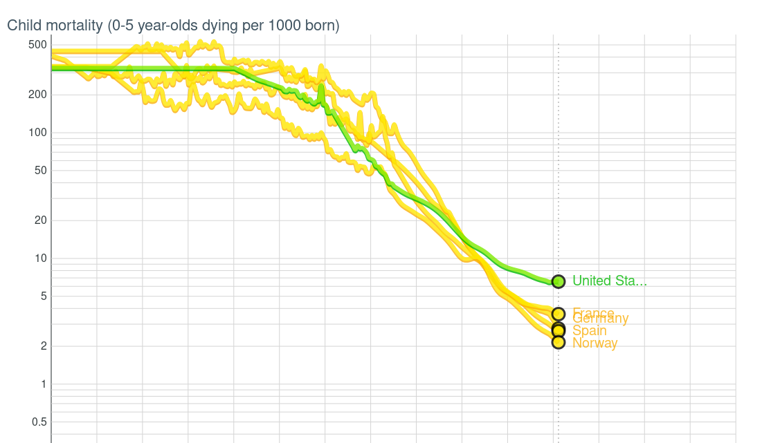
Fortunately, such an indicator exists, and it is infant mortality, as Dr Hans Rosling explains in his book Factfulness. Young children are very fragile, so it is a good thermometer of society to look at this index. If only 14 out of 1,000 children die in Malaysia, that means that 986 children survive.
Looking at the infant mortality rate, we can see that the infant mortality rate for children between 0 and 5 years of age has been drastically reduced around the world, from a tremendous 50% in the 19th century to 2 per 1,000 in countries like Spain. It is curious that countries such as the United States, with higher health spending than European countries, have an infant mortality rate of 5 per 1,000.
This figure shows that they need to improve the life expectancy of newborn children through more effective healthcare or better living conditions.
In addition to the economy and health, the pillars of our society, we also have to look at the impact on the environment, with indicators such as CO2 emitted into the atmosphere or the consumption of materials per inhabitant.
CO2 emissions have increased in all countries throughout the 20th and 21st century, as higher emissions are directly related to a better quality of life, as there is more industry, transport and economic resources to create, move and buy materials.
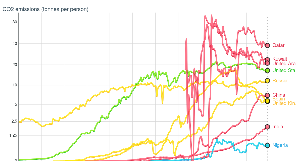
The hope comes from observing that the countries with the highest emissions, such as the United States and the Europeans, have stabilised or even reduced their emissions in recent years by generating energy in more sustainable ways.
This is undoubtedly a good sign, although it should be borne in mind that evolving countries such as China and India continue to increase their emissions and are close to reaching a stabilisation point in the coming years.
In terms of material footprint per inhabitant, in Western countries there has been a large reduction since 2005, from 40 to 30 tonnes per inhabitant in the United States, coinciding with a greater awareness of sustainability and less consumption of single-use products.
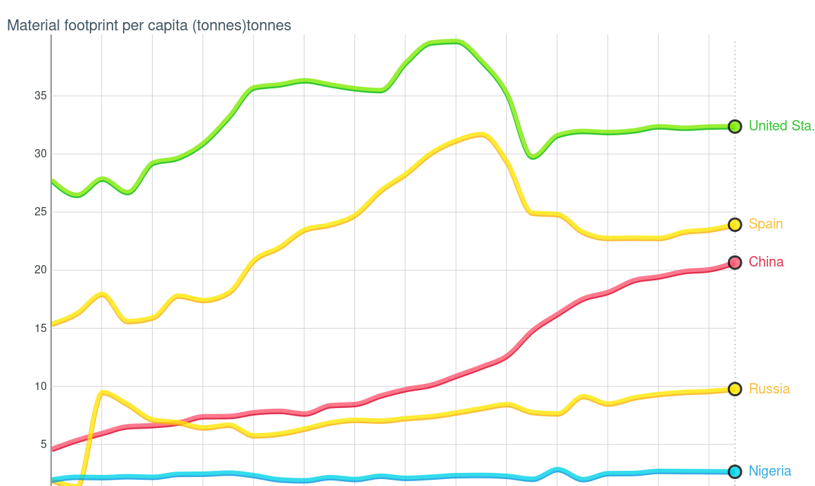
This is a trend that is observed in many other countries, and it seems that we have reached a plateau in terms of material use per person, consuming more durable, recycled, more sustainable and less demanding of raw materials.
With these indicators, one is filled with hope about how we are getting better as a society, healthier and more sustainable. Of course, there is still a long way to go, but we are heading in the right direction.
This is the usefulness of big data, to really know what is working and what is not, in order to take the steps to make life better for citizens everywhere in the world. We know how to have a more sustainable and democratic society, we just have to keep working on it every day.
Data sources: Gapminder


